Introducing Mac Themes Garden!
The short version
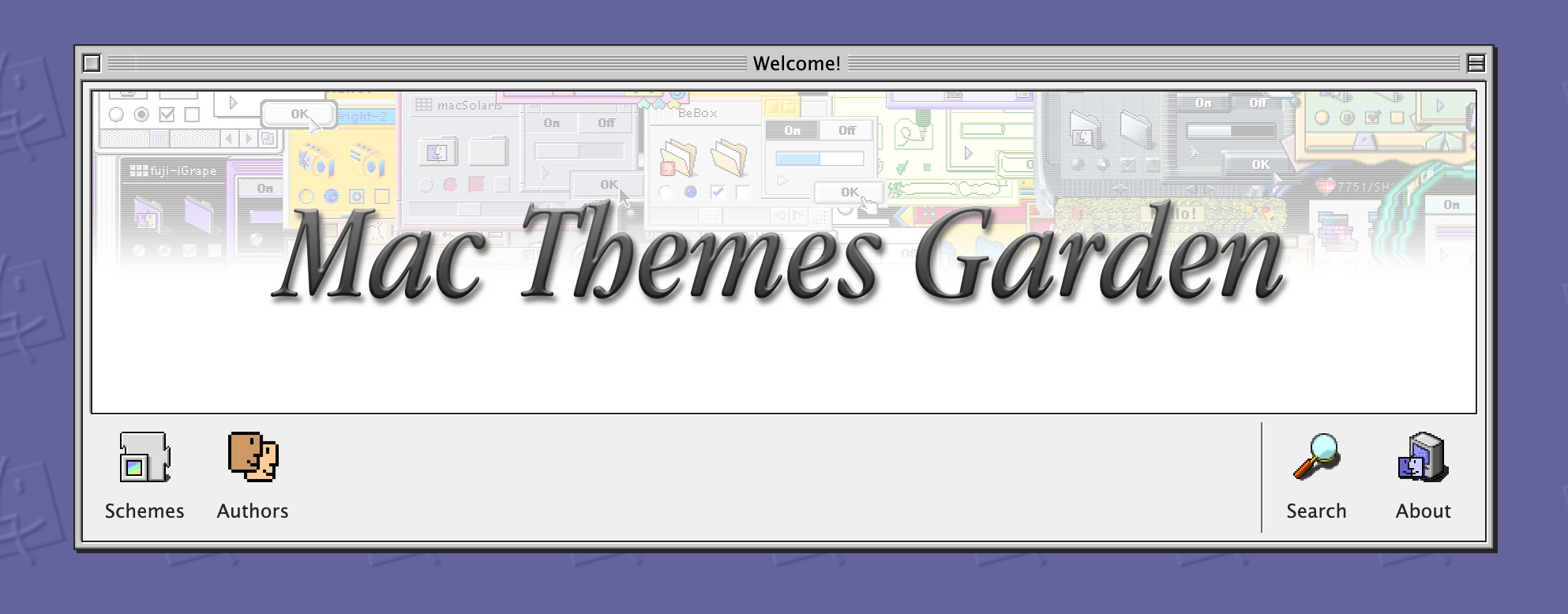
I've "launched" the Mac Themes Garden! It is a website showcasing more than 3,000 (and counting) Kaleidoscope from the Classic Mac era, ready to be seen, downloaded and explored! Check it out! Oh, and there also is an RSS feed you can subscribe to see themes as they are added/updated!
And yes, there is a button that you can include on your website! Grab it here! Isn't it cute?

Now, for the yapping. Note: if you're reading this in an RSS reader, you might want to open the article on my website directly as it contains a bunch of CSS demos and those won't work well in an RSS reader.
Some background
If you know me from Online, you may know that I've been running the Mac Themes Bot on Bluesky/Mastodon/Cohost for a few years now.
The idea of the bot was simple, showcasing custom themes from the Mac OS X and Classic Mac eras, on the rate of one an hour. Since I was inspired by @kaleidoscopemac on Twitter, I only started showcasing themes made for ShapeShifter by Unsanity. A while later, that Twitter account got suspended.
Since I already had the tooling in place to scrape and post themes for OS X, I figured I could add themes for Kaleidoscope (OS 7/8/9) into the mix. After trying (and failing) to get the original dataset from the author of the bot, I set on to scrape the Wayback Machine for records of the Kaleidoscope Scheme Archive.
From that point on, my bot would post themes every hour, with a classic theme on even hours and an OS X theme on odd hours[1].
The years passed, the bot carried on, made me and a bunch of other people smile on the various websites where I would run it. The Cohost incarnation in particular was really special because Cohost was a special site, but also it was full of nerds (complimentary) and people would go nuts for the random gems in there.
Around maybe early 2023, I grew frustrated of the fact that the only images I had for the Kaleidoscope themes schemes were those tiny .gif files from the late 90s.
"Recording" 25-year-old schemes
So I did the reasonable thing: set up a terribly manual process to take screenshots and record the author information of the ~4,000 themes available, with the intention of making a website showcasing everything once I was done.
Without going into details (which you can read here), the process looks like this:
- Open my Mac OS 9 VM in UTM.app (QEMU frontend)
- Go through the folder of schemes
- Select a given scheme, apply it
- Take 3 screenshots:
- One of the scheme's about box.
- One of the scheme being used in the Finder/regular desktop situation.
- And finally, a screenshot of the application KSA Sampler in order to mimic the original screenshots from the Kaleidoscope Scheme Archive. That specific screenshot would get pasted into Photoshop to be cropped/trimmed of its opaque background using Photoshop Actions.
- Write down the name, author and release year of the scheme
- Find the corresponding .sit archive file
- Record all of this in a record inside an Airtable database.
Here's how it looks inside Airtable:
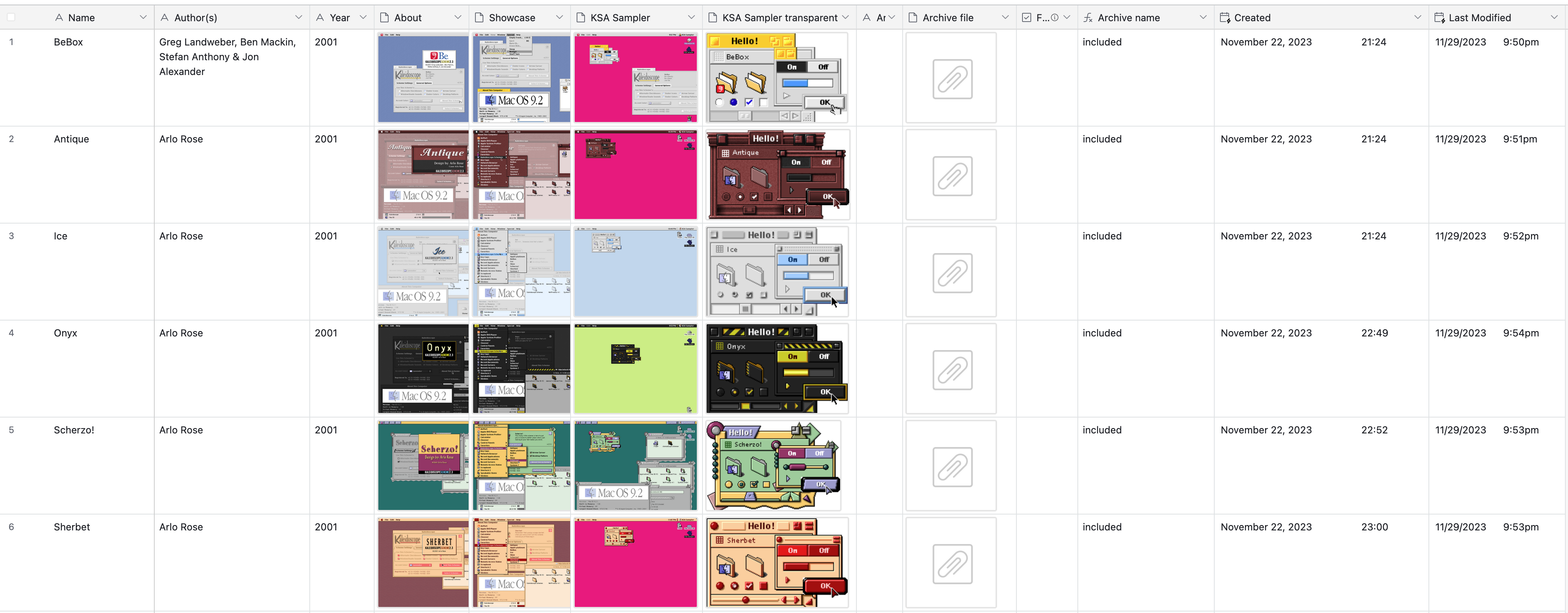
On a good day, I can maybe record, I don't know, a dozen or so themes an hour.
But Damien, why didn't you automate this process?!
I'm glad you asked! I tried! But I, at least until now, could not find a good way to reliably perform the actions I need to take. And that's not even touching on the fact that sometimes a scheme doesn't have any author or year information! Sometimes the author inside the Kaleidoscope scheme file is completely wrong, and the actual author is written in a separate "Read me" file. Sometimes there's barely any information to go by, sometimes the scheme is buggy and would crash my VM.
At that point, the only automations I have are:
- a Keyboard Maestro macro that calls the
qemu-monitorfor the running VM, takes a lossless screenshot and puts it into my clipboard, ready to be pasted - Photoshop actions to:
- create a document from the clipboard
- after cropping, remove all pixels of a given color in a document and trim it to remove extra alpha pixels (for the KSA Sampler screenshots above)
- A Quickeys shortcut to call "Hide Others" inside of Mac OS 9. Turns out this action didn't have a keyboard shortcut until Mac OS X? Didn't know that!
Beyond that, I'm afraid it's all manual since I want to record data that isn't straight forwardly extracted by just looking at files 😔.
At any rate, I was and thought "I'll finish recording all these schemes, and then I'll make the website"...
Dear reader, I am not done. By my own estimations, I am maybe halfway done. I do not know when I will be fully done, but my good friend Sage pushed me to: make the damn website already.
And they were right, I should have made the website earlier! It was a fun and challenging distraction, and fuck me I could use distractions these days.
Making Da Website
So, around January of this year, I've started work on the website.
The first step was to interface with the Airtable API in order to download the data from my database and store all the assets into a folder in my repository.
Nothing too crazy, but had to be done.
I did need to be careful around caching and not re-downloading images I already had on disk. We're talking about like, ~2,500 rows each containing 3 images, and you don't want to re-download 7,500 PNG files every time the script needs to run.
With the data on hand, the real fun began.

The proof-of-concept was using Eleventy which I chose purely because I had just finished remaking my website (you're reading it now!) using it, so I figured it would be a good fit because of its simplicity and speed.
And it might have been if it wasn't for WebC being so wonky. You see, I knew I wanted to have multiple OS9-like "windows" in the website's layout. So I figured that, surely, WebC could let me make a "component" and make a UI that way and, I swear to god, I could not make it work that way.
It seems WebC is purely for Web Components and nothing else, which itself is fine, but that wasn't going to cut it.
I briefly experimented with a paired short code, but I wasn't going to write HTML inside a JavaScript string. I wanted to have fun on this project.
The nitty-gritty
So I switched to Astro whose concept of components was closer to what I wanted to do here, and I already knew how to use it because erambert.me uses it.
I will not do a play-by-play of the making of the website, because once the ball was rolling, most of my time was spent playing with UI ideas and using Astro's content collections such that building the whole website as a bunch of static pages didn't take forever.
Don't get me wrong, Astro is plenty fast as it is, not as fast as Eleventy but still fast!
The "problem" is that I am playing with big numbers. Let's think about them:
- 3,942 themes
- 868 authors
As it is, if we assume one page per scheme and one page per author (which would list all the themes for that author), we arrive at: 3,942 + 868 = 4,810 pages. Which isn't terrible, but that's already a lot of pages, and we're not doing anything fancy with it.
Let's start being fancy, let's add pagination and let's say we want to show 51 themes per page. Where:
- T is the number of themes in the set (3,942)
- A is the number of authors in the set (868)
- P is the page size (51)
const totalPages = (T * A) + Math.ceil(T / P)
// 4,888 pages
That's 4,888 pages! Except I then wanted to add some fancy things like an authors page (A / 26 (for each letter in the alphabet)), that's another ~33 pages. This gets us close to 5,000 pages. Which is fine, but it means every page better be really quick to generate in order for the build time to not balloon out-of-control.
That's where I had to be careful. I wanted the author pages to show all the themes made by a given author, which I naively implemented like this:
export const getStaticPaths = (async () => {
  const authors = await getCollection("authors");

  return authors.map((a) => {
    return {
      props: { author: a },
      params: {
        author: a.data.slug,
      },
    };
  });
}) satisfies GetStaticPaths;
const { author } = Astro.props;
const themesByAuthor = (await getCollection("themes")).filter((t) => {
  return t.data.authors.some((a) => a.id === author.id);
});
Sure, this seems fine as it is. After all, it "only" takes ~30ms to run in development! But running our math from earlier, this will run for every single author page. Suddenly we're looking at:
30ms × 868 = 26,040 ms (26s) 😱!
After all, we're iterating over the 3,942 schemes 868 times, this isn't great!
What's the fix then?
As it is almost always the case when it comes to performance: doing less work and only doing the hard work once! I took advantage of Astro's collection references. I first declare a reference for authors inside my themes schema:
const themes = defineCollection({
  loader: themesLoader,
  schema: z.object({
    name: z.string(),
+   authors: z.array(reference("authors")),
    year: z.string().optional(),
    mainThumbnail: z.string(),
    thumbnails: z.array(z.string()),
    archiveFile: z.string(),
    // ...
  }),
});
Which mean that I could simply call the getEntries method to get the authors of a given theme.
export const getStaticPaths = (async () => {
  const authors = await getCollection("authors");

  return authors.map((a) => {
    return {
      props: { author: a },
      params: {
        author: a.data.slug,
      },
    };
  });
}) satisfies GetStaticPaths;
const { author } = Astro.props;
const themesByAuthor = await getEntries(author.data.themes);
Which, depending on the number of themes, takes ~10ms at most, for most pages it takes less than 5ms! That is much better.
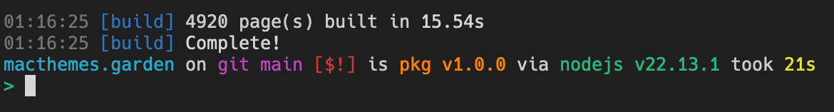
By applying this technique, I managed to keep the build time of the site under control and Astro builds almost 5,000 pages with various queries between each other in less than 16s!
Getting cute with it
Like mentioned above, I knew I wanted to mimic a Mac OS 9 UI for the website. Now, I could have just used images to make the UI... but where's the fun in that?
So of course I've used every CSS trick in the book to achieve the look. Let me go through some of the pieces of UI and explain how I re-created them.
The window frame
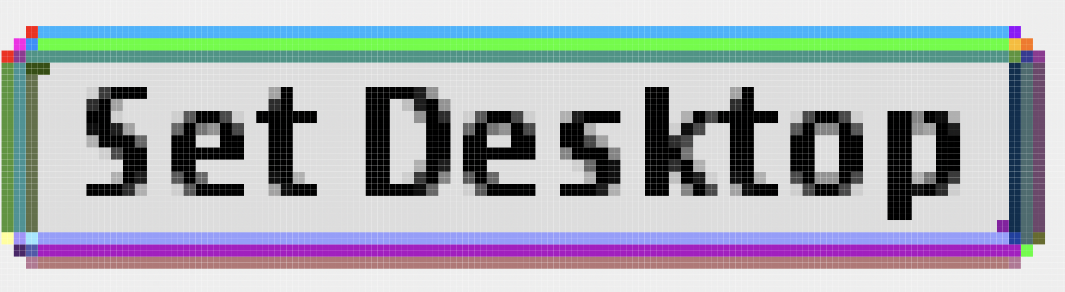
This is, obviously, a big part of the UI, so I wanted to be as close to the actual look of OS 9 as possible. Let's take a simple, empty example:
A lot of the styles involve using multiple box shadows to achieve the "broken border" effects in the different areas of the main UI chrome. Here is the style for the main window body (in white in the preview above):
.macos9-window-body {
  border: 1px solid var(--primary-black);
  box-shadow:
    -1px -1px 0 rgb(from var(--primary-black) r g b / 40%),
    1px 1px 0 var(--primary-white);

  --top-left-shadow: var(--grays-600);
  --bottom-right-shadow: var(--primary-white);
  box-shadow:
    -1px -1px 0 var(--top-left-shadow),
    -1px 0px 0 var(--top-left-shadow),
    0 -1px 0 var(--top-left-shadow),
    1px 1px 0 var(--bottom-right-shadow),
    1px 0 0 var(--bottom-right-shadow),
    0 1px 0 var(--bottom-right-shadow);

  background-color: var(--primary-white);
}
The title bar
That part was fun, there's a lot going on so let's take a look step by step. Here's how it looks and the HTML markup:
<div class="macos9-window-titlebar">
  <button class="button close" data-action="close">
    <span class="button-dots"></span>
  </button>
  <span class="filler"></span>
  <span class="title-text">Welcome!</span>
  <span class="filler"></span>
  <button class="button zoom" data-action="zoom">
    <span class="button-dots"></span>
  </button>
  <button class="button collapse" data-action="collapse">
    <span class="button-dots"></span>
  </button>
</div>
The "stripes" pattern is done using a repeating CSS gradient and two pseudo-elements on each side with a slightly different gradient:
.macos9-window-titlebar > span.filler {
  flex: 1;
  background-color: #dddddd;
  background-image: linear-gradient(#ffffff, #ffffff 50%, #777777 50%, #777777);
  background-repeat: repeat;
  background-size: 100% 2px;
  height: 12px;

  position: relative;

  &::before,
  &::after {
    content: "";
    position: absolute;
    width: 1px;
    background-size: 100% 2px;
    display: block;
  }

  &::before {
    left: 0;
    top: 0;
    bottom: 0;
    background-image: linear-gradient(#fff, #fff 50%, #cccccc 50%, #cccccc);
    border-bottom: 1px solid #cccccc;
  }
  &::after {
    right: 0;
    top: 0;
    bottom: 0;
    background-image: linear-gradient(#ccc, #ccc 50%, #777777 50%, #777777);
  }
}
We then have the window buttons which are...you guessed it, a lot of box-shadows and borders put together:
.macos9-window-titlebar > button {
  appearance: none;
  border: none;
  height: 13px;
  width: 13px;

  background: transparent;
  background-image: linear-gradient(135deg, #9a9a9a 0%, #f1f1f1 100%);
  background-size: 9px 9px;
  background-position: center;
  box-shadow:
    inset 1px 1px 0 var(--grays-700),
    inset -1px -1px 0 var(--primary-white),
    inset 0 0 0 2px var(--primary-black),
    inset 3px 3px 0 var(--primary-white),
    inset -3px -3px 0 var(--grays-700);

  position: relative;
  z-index: 0;

  &:active::before {
    content: "";
    inset: 2px;
    background-image: linear-gradient(
      135deg,
      rgba(53, 53, 53, 0.8) 0%,
      rgba(156, 156, 156, 0.8) 100%
    );
    display: block;
    position: absolute;
    z-index: 1;
  }
}

.macos9-window-titlebar > button .button-dots {
  position: absolute;
  inset: 0;
  display: block;

  &::before {
    content: "";
    position: absolute;
    top: 0;
    right: 0;
    width: 1px;
    height: 1px;
    background-color: #cccccc;
  }
  &::after {
    content: "";
    position: absolute;
    bottom: 0;
    left: 0;
    width: 1px;
    height: 1px;
    background-color: #cccccc;
  }
}
Oh, and there is also a neat trick: I'm using :has() to sometimes re-align the title so it's actually visually centered when there is an uneven number of buttons on each side:
.macos9-window-titlebar:has(.button.close, .button.zoom, .button.close)
.button.close + .filler {
  padding-left: calc(13px + var(--macos9-window-titlebar-gap));
}
Buttons
This is the part of the design that made me question my sanity and my commitment to the bit. Let's take a look at a simple button:
Looks simple enough, right? Well. How do you preserve the pixelated look in CSS without using images? Why, you go insane and draw the pixels yourself using CSS Grid areas of course! This was a suggestion from Sage.
This requires some planning because CSS Grid areas have to be rectangular. That's when I went to Photoshop and drew a bunch of colored rectangles for each area with unique colors:
That's 38 areas for the inner/outer shadows to cover, as well as 4 areas for the plain background! It's easy enough to just generate that using JSX, we take care to add a data-n attribute which will help us target the areas in CSS:
<a className="os9-button">
  <div className="grid">
    {Array.from({ length: 38 }).map((_, index) => (
      <div
        key={index}
        className="shadow"
        data-n={String(index + 1).padStart(2, "0")}
      />
    ))}
    <div className="bgd" data-n="1"></div>
    <div className="bgd" data-n="2"></div>
    <div className="bgd" data-n="3"></div>
    <div className="bgd" data-n="4"></div>
    <div className="label">{children}</div>
  </div>
</a>
Then, we have to use Sass to create the necessary selectors:
@use "sass:math";

@for $i from 1 through 38 {
  $n: $i;
  @if $n < 10 {
    $n: "0#{$n}";
  }
  .shadow[data-n="#{$n}"] {
    grid-area: s#{$n};
  }
}

@for $i from 1 through 4 {
  .bgd[data-n="#{$i}"] {
    grid-area: bg#{$i};
  }
}
Then...we "draw" our CSS areas with code:
.grid {
  display: grid;
  grid-template-areas:
    "... ... s01 s02 s02 s02 s03 ... ..."
    "... s04 s05 s06 s06 s06 s07 s08 ..."
    "s09 s10 s38 s11 s11 s11 s12 s13 s14"
    "s15 s16 s17 s17 bg1 bg1 s18 s19 s20"
    "s15 s16 s37 bg2 txt bg3 s18 s19 s20"
    "s15 s16 s37 bg2 bg4 s21 s18 s19 s20"
    "s22 s23 s24 s25 s26 s26 s27 s28 s29"
    "... s30 s31 s32 s32 s32 s32 s33 ..."
    "... ... s34 s35 s35 s35 s36 ... ...";
  grid-template-columns: repeat(4, max-content) 1fr repeat(5, max-content);
  grid-template-rows: repeat(4, max-content) 1fr repeat(4, max-content);
}
Yes, this took a while and multiple tries to get right LMAO. The full stylesheet is here if you're curious.
Random tidbits
Window controls
The windows are actually interactive! You can "zoom" (expand) the main window and collapse it by clicking the right button/double-clicking the title bar!
const windowElement = document.querySelector('#demo-window');
windowElement.querySelectorAll("button").forEach((button) => {
  if (button.dataset.action === "collapse") {
    const titlebar = windowElement.querySelector(".macos9-window-titlebar");
    if (titlebar) {
      titlebar.addEventListener("dblclick", (e) => {
        if (e.target instanceof HTMLButtonElement) {
          return;
        }

        windowElement.classList.toggle("collapsed");
        window.getSelection()?.empty();
      });
    }
  }
  button.addEventListener("click", () => {
    const action = button.dataset.action;
    if (action === "collapse") {
      windowElement.classList.toggle("collapsed");
    } else if (action === "zoom") {
      windowElement.classList.toggle("zoomed");
    }
  });
});
Open Graph images
I could have taken the easy route when making the open graph images for each theme and simply dropped a PNG of the main window, something like this:
This is very cute in apps like Discord, but looks terrible about everywhere else because of the wrong aspect ratio and the non-support of alpha channels.
So I took another approach:
But, obviously, doing that kind of compositing manually would be a terrible idea, and I'm not good enough with ImageMagick, so I ended up using Vercel's satori to lay the two images out and generate an image for every single theme:
import type { InferEntrySchema } from "astro:content";
import satori from "satori";
import sharp from "sharp";

export async function generateOpenGraphImageForTheme(
  theme: InferEntrySchema<"themes">,
) {
  let blurredImageData: Buffer | undefined;
  const margin = 20;
  const imageDimension = {
    width: 1200,
    height: 630,
  };

  if (theme.thumbnails.length > 1) {
    blurredImageData = await sharp("public/" + theme.thumbnails[1])
      .resize(imageDimension.width, imageDimension.height, {
        fit: "cover",
        position: "top",
      })
      .blur(5)
      .toBuffer();
  }

  const mainThumbnailSharp = sharp("public" + theme.mainThumbnail);
  const mainThumbnail = await mainThumbnailSharp.png().toBuffer();

  const svg = await satori(
    <div
      style={{
        display: "flex",
        alignItems: "center",
        justifyItems: "center",
        width: "100%",
        height: "100%",
        position: "relative",
        backgroundColor: "white",
      }}
    >
      {blurredImageData && (
        <img
          src={toArrayBuffer(blurredImageData)}
          style={{
            position: "absolute",
            filter: "brightness(40%)",
            inset: 0,
          }}
        />
      )}
      <img
        src={toArrayBuffer(mainThumbnail)}
        style={{
          padding: margin,
          width: "100%",
          height: "100%",
          boxSizing: "border-box",
          objectFit: "contain",
          objectPosition: "center center",
        }}
      />
    </div>,
    {
      width: imageDimension.width,
      height: imageDimension.height,
      fonts: [],
    },
  );

  return sharp(Buffer.from(svg));
}

function toArrayBuffer(buffer: Buffer) {
  const arrayBuffer = new ArrayBuffer(buffer.length);
  const view = new Uint8Array(arrayBuffer);
  for (let i = 0; i < buffer.length; ++i) {
    view[i] = buffer[i];
  }
  return arrayBuffer;
}
I then put together a script to process all the images by spawning multiple process, the whole script takes ~2min30 to run on my M1 Max Mac Studio and generate ~3900 images.
As a bonus, these images will also be used by the Mac Themes Bot when available going forward.
What's next
I don't know how long it will take, but I want to continue/finish "recording" the schemes I have access to. Hopefully I am done before next year lolsob. You should subscribe to the RSS feed to see those as I update them!
Apart from that, I have a bunch of ideas:
- a "search by color" feature
- a way to see/showcase the custom icons contained in each scheme when applicable. There are some gems in there, trust me!
- Somehow, find a way to hook the site into InfiniteMac to quickly view a scheme "live"
- a user-submitted gallery of old Macs running the schemes from the site. Hit me up if this is something you'd want to participate in :)
That's all, folks, have a good life.
- damien
or vice versa, I honestly do not remember nor do I care to check the Git history. ↩︎
Webmentions (2) What's that?
-

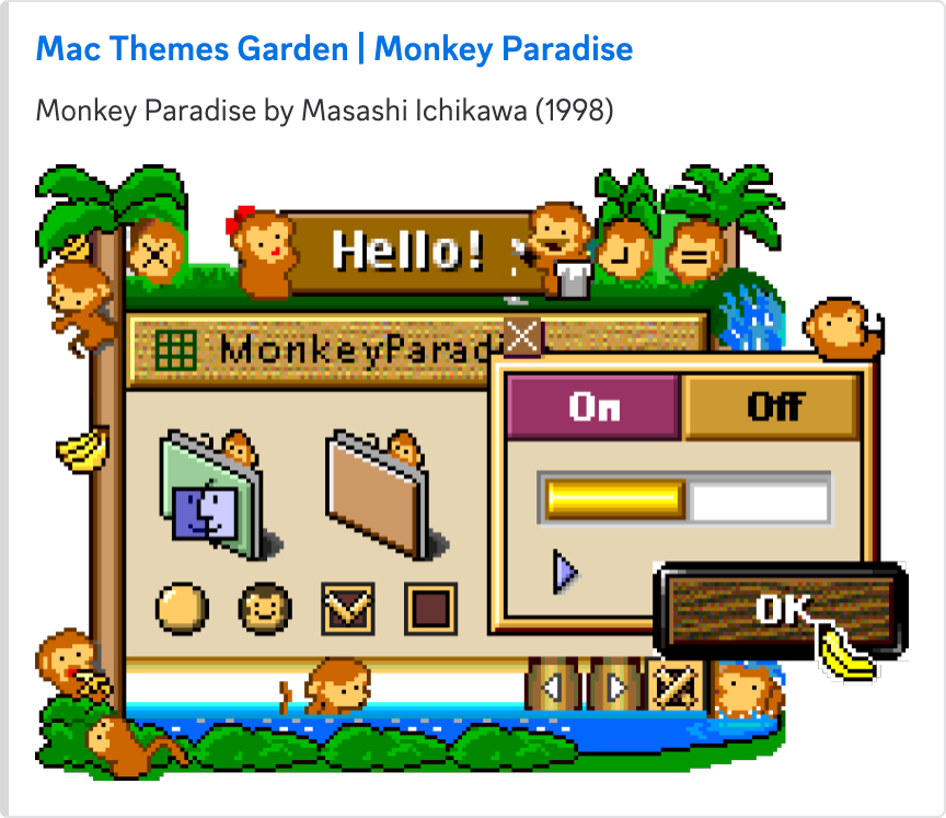
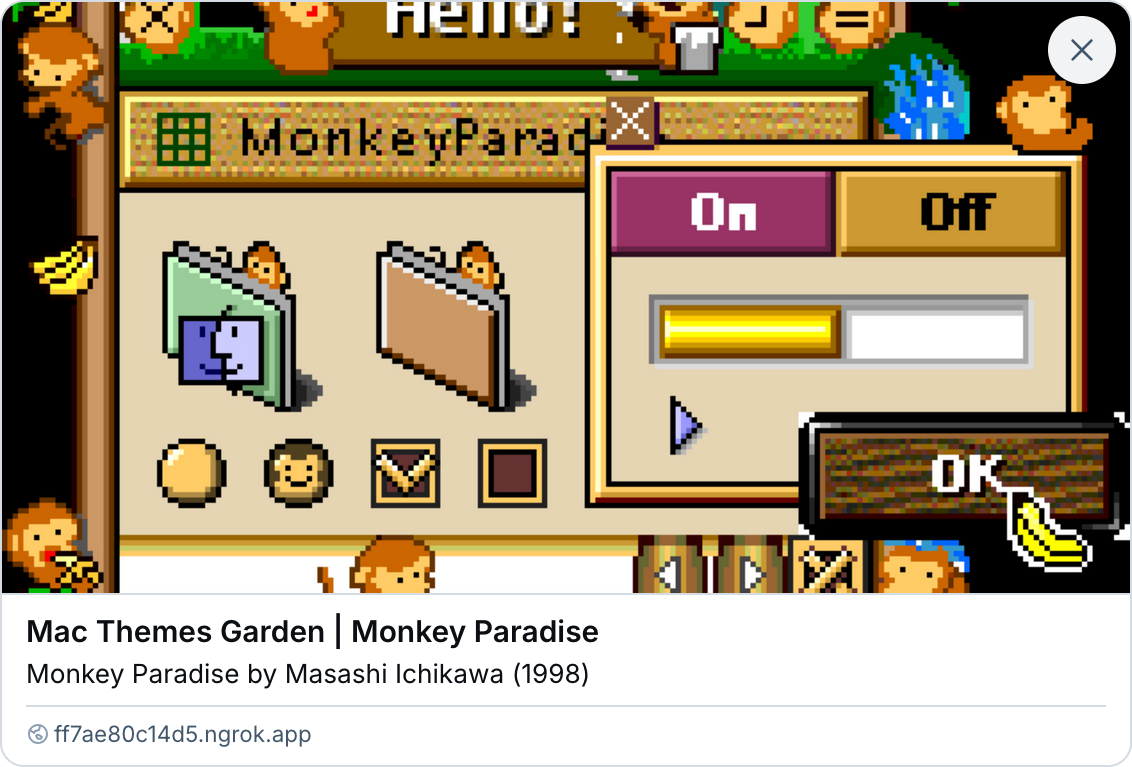
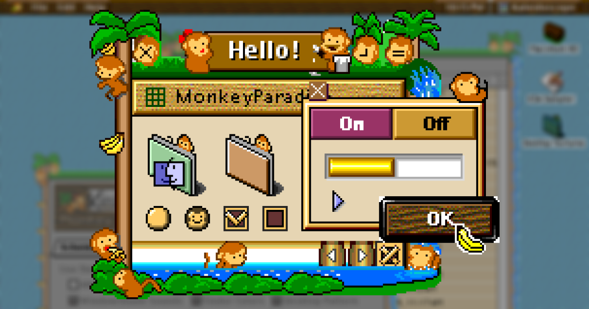
This is glorious on multiple levels: https://macthemes.garden/
Not least because @eramdam manually generated new screenshots for ~~all 4000~~ many of the themes.
More details about building the website here: https://damien.zone/introducing-mac-themes-garden/